Background
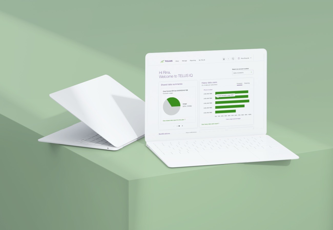
As a part of a series of optimizations to our previous work on the TELUS IQ Mobility Management Portal, Pound & Grain was approached with the need to create a standalone web application for desktop and tablet that enabled enterprise customers to add information about their corporate structure. This data would be used to aid in more meaningful reporting for those users and allow for all connected applications to speak a common language when referring to the structures within the users organization. The client had already created a working prototype, however they were looking to overhaul the experience as they planned to transition this application from internal facing to customer facing.
As the lead designer on this project I was responsible for the whole design process, from assessing the client needs in discovery to user experience design and visual design.
The user needs we wanted to address with this project were:
Streamline reporting for enterprise mobility customers.
Reduce learning curve in onboarding for TELUS reporting tools by using a common language between them.
Allow client team admins to easily keep their corporate structure up to date in the TELUS ecosystem.
Due to the data heavy nature of the application and the behaviour of the users, I designed the experiences for desktop and tablet.
Information Architecture
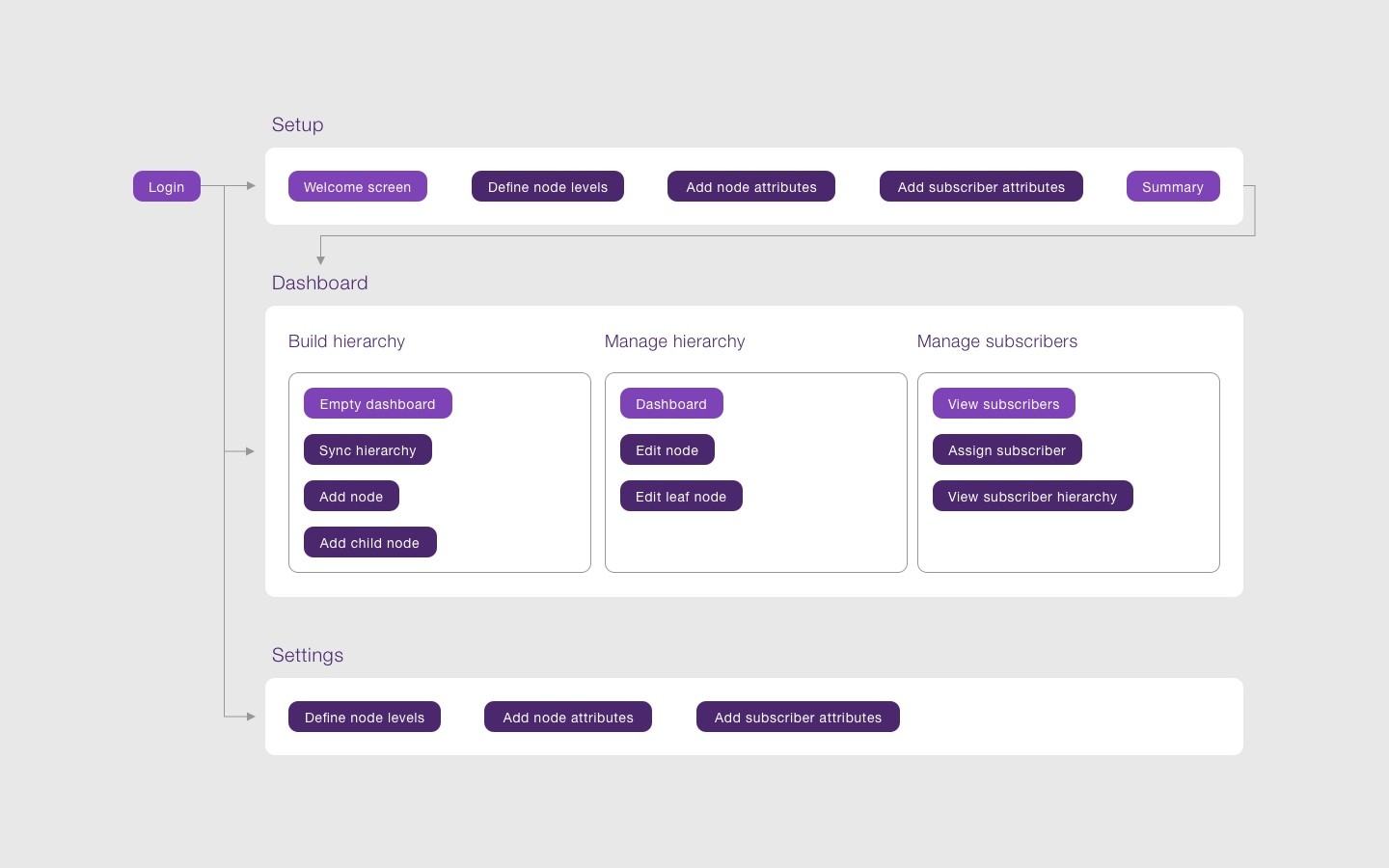
Using the prototype as a reference point, I created an information architecture mapping out key features and how they fit together. The approach I took was to introduce the user to the features of application gradually, first through the initial setup of the application and then revealing one level of functionality at a time during the main app experience.
Wireframing + Design
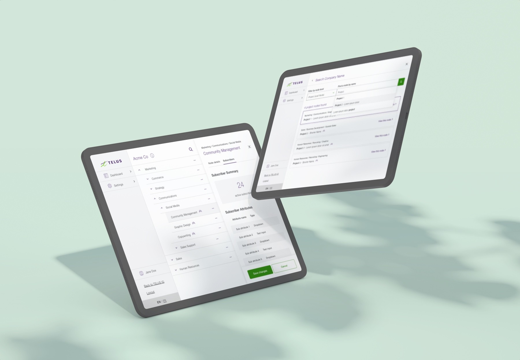
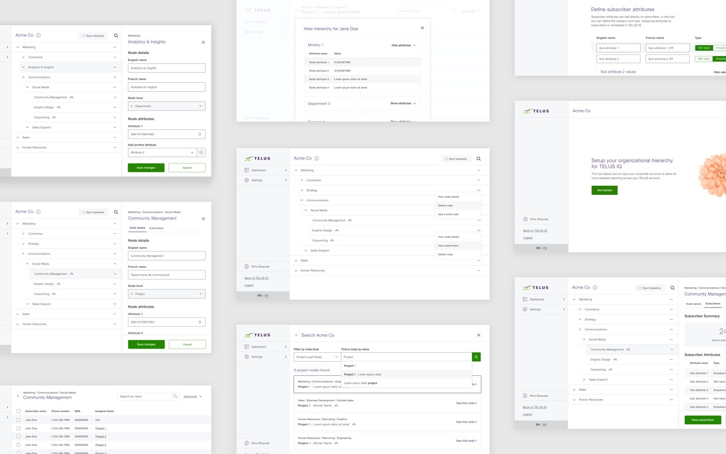
While working closely with the client to identify the functional requirements and limitations, as well as synthesizing feedback from beta testers, I created a series of high-fidelity wireframes to capture: new user onboarding, hierarchy creation and application flows. The layout utilizes a 2 column layout with a persistent sidebar to allow the user to quickly jump between sections and, when needed the primary content column shrinks to make room for a 3rd column to display info for a specific node. Once the requirements were finalized, I continued into the design stage, applying TELUS design principles and refining the interface.
Component Library
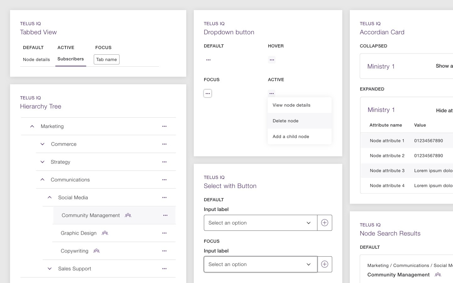
As this was a new product within the TELUS IQ ecosystem I was able to use some existing components that had been created during the our previous engagement with this team. I built upon this library with a series of purpose-built components for displaying the corporate hierarchy of the users, as well as a series of new interaction patterns to tie it all together.
Outcome
This project is to be rolled out to two audiences, the secondary audience: TELUS IQ administrators, will serve as a beta testing stage to allow us to fine-tune the experience as needed, before rolling out to the primary audience of TELUS IQ customers. We have received very positive initial feedback as a majority of users have seen an improved workflow with this new application, as well as a deeper understanding of how the data impacted will improve reporting in other TELUS products.

