Omara Health Exchange
Bridging the gap between health and technology
Background
The TELUS team behind their Health Exchange offering, approached us to rebrand their platform that allows health providers and vendors to seamlessly and securely exchange health data between each other. As they grew into the industry, they recognized a need to be seen as a brand, rather than a product within the TELUS portfolio. This product competes directly with offerings from the likes of Amazon and Facebook, so we were faced with the challenge of breaking into an industry of healthcare technology that was currently dominated by some big names.
The key challenges we were tasked with addressing in this project:
Break into a market currently dominated by big tech.
Strike a balance between TELUS affiliation and a standalone brand.
Articulate the highly technical products in an engaging way.
Naming
To ensure the client stood out in the competitive healthcare technology sector, they wanted something that was own-able, unique and stood on its own when put up against its competition.
The client made many connections between their product and the natural world, most notably the interconnected nature of rivers and streams, which served as a jumping off point for our teams naming exercises. We explored a variety of directions, from an abstraction of nature, to sci-fi and beyond. What we landed on felt inherently connected to the natural world, struck a nice visual balance and translated favourably internationally.
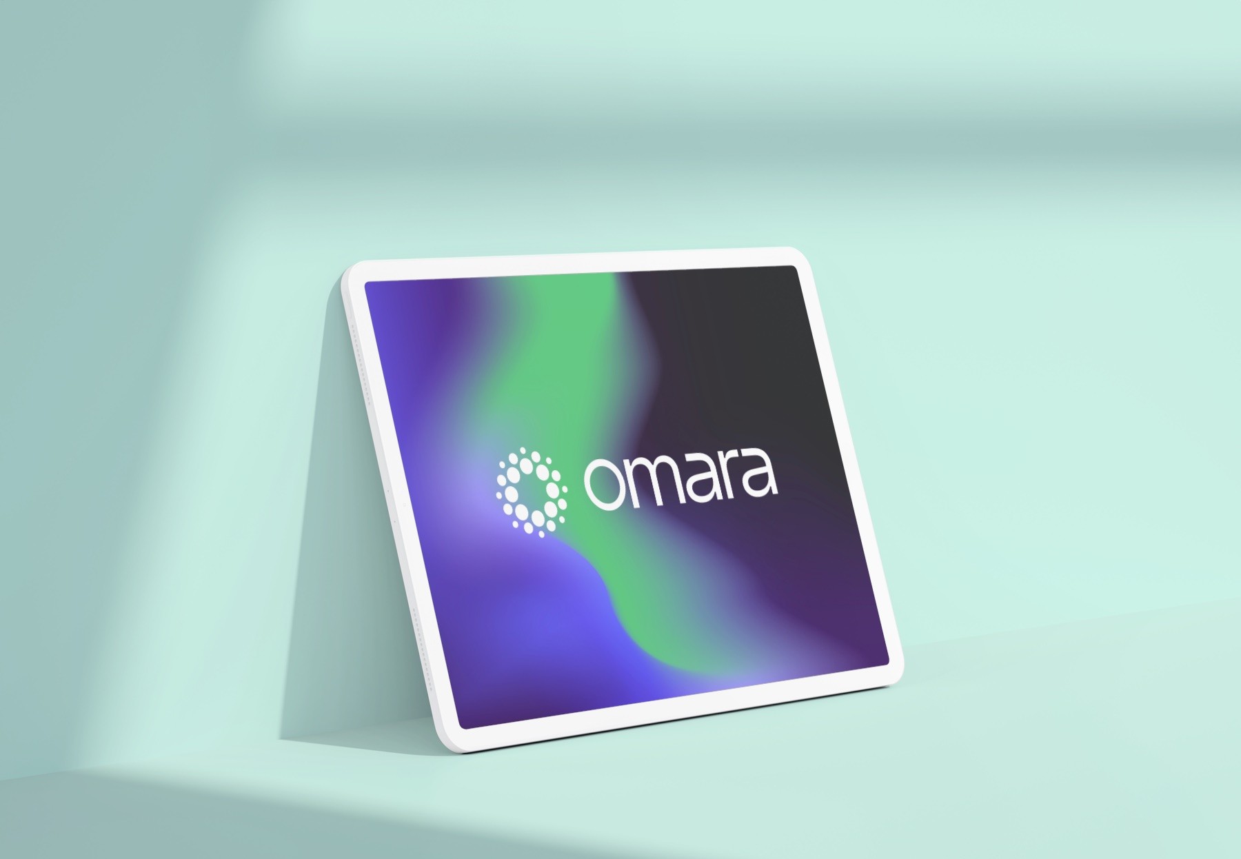
Omara means "flourishing" which is powerful and ambiguous at the same time, allowing us to really own it and build the brand story around it. Visually, the word has a nice balance and it can be pronounced smoothly with a natural rhythm.
Concepting
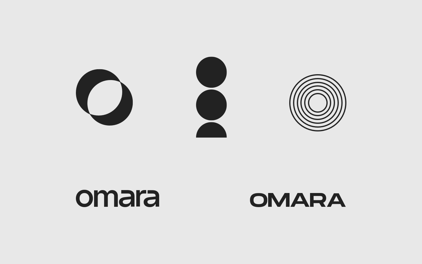
At this stage, I explored a variety of different ways we could articulate Omara's values and stand out among the competition. Explorations included visual language, photography, typography and logo symbols.


Brand Guidelines
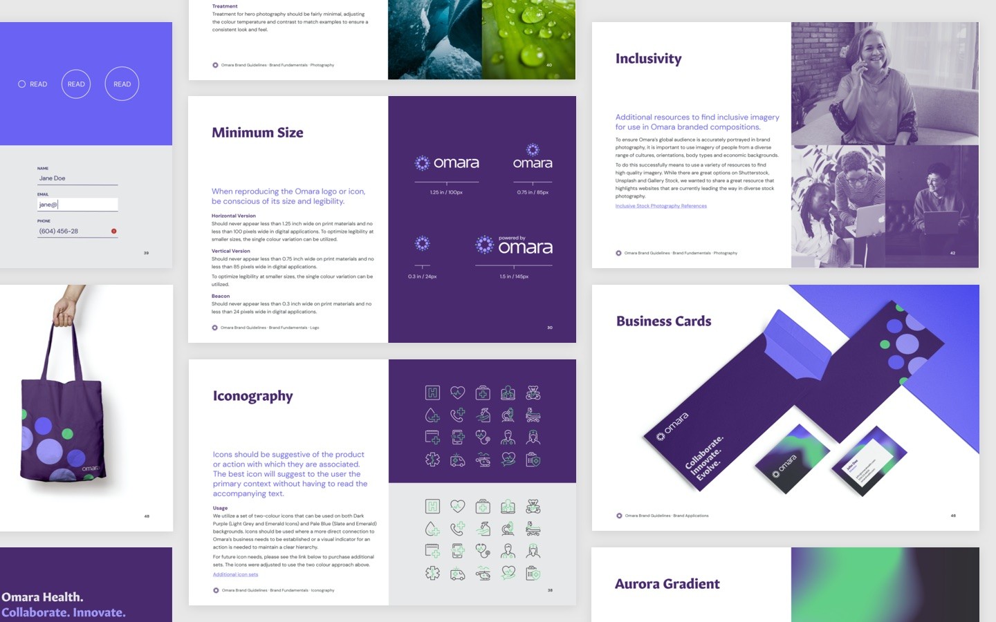
After fine tuning the selected logo mark and creative concepts, we worked to create a full brand book to aid the Omara team in creating brand communications and marketing materials. During this process, we were asked to adjust the second concept above, so it more closely tied into the TELUS masterbrand. This included guidelines for the usual typography, iconography, logo system, colour palette and imagery, while ensuring extra consideration for use of the visual language in interactive and animated concepts.
Web Experience
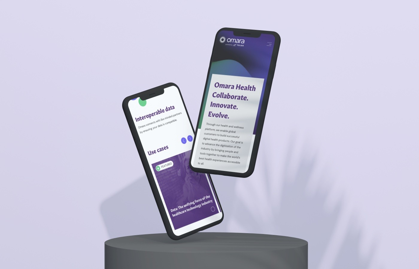
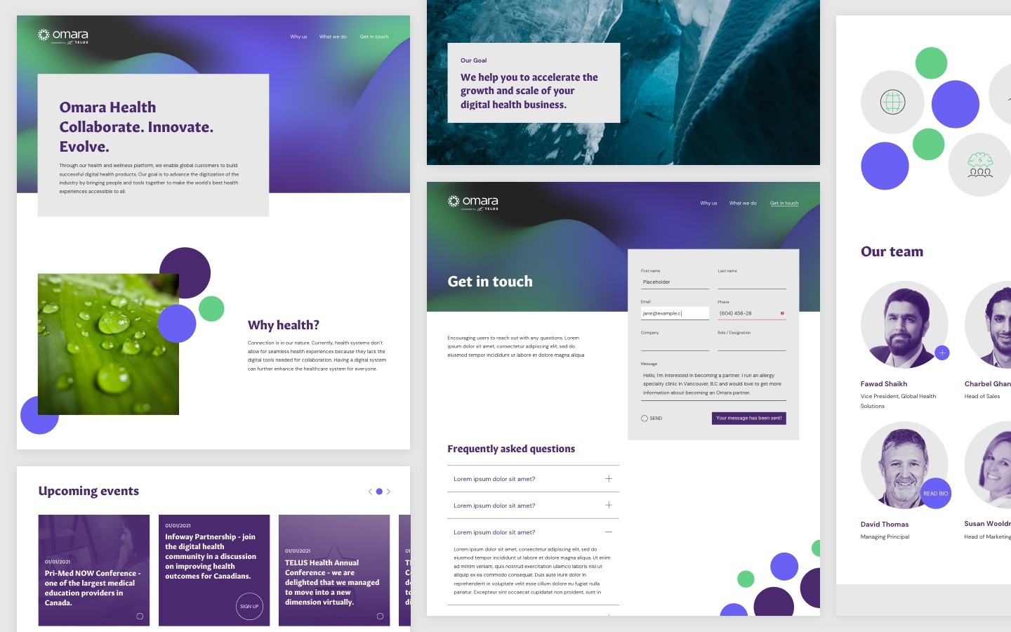
To officially launch this new brand, we created a unique micro site experience that brought all of the brand fundamentals to life. The web experience incorporates the motion principles defined in the branding stage, including subtle touches of parallax, a dynamic hero treatment of the aurora gradient and unique microinteractions for buttons throughout. This microsite educated these users on Omara's value proposition, their guiding principles and provided a channel for them to get in contact with the Omara sales team for more information.
